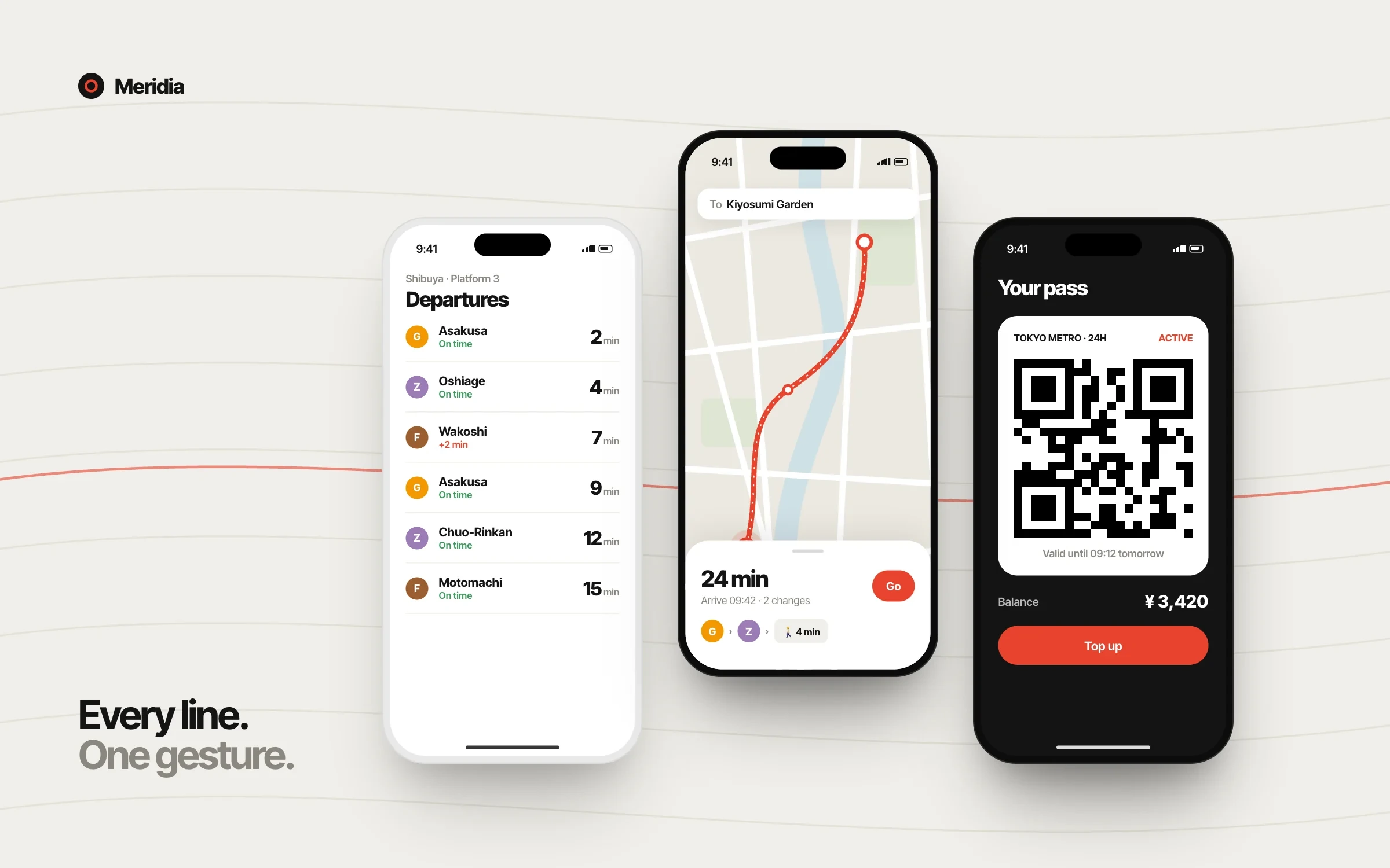
Meridia
Every line. One gesture.
Overall UXE Score
9.16
18 jurors · +0.9 vs season average
- Recognition
- Editors’ Choice
- Recognized
- 9 Feb 2026
- Season
- Quarter 1, 2026
- Studio
- Studio Kanso, Tokyo
- Categories
- Interaction Design · Mobile Experience · Consumer
- Platforms
- iOS, Android, Web
01/Overview
A transit companion that collapses route planning, live departures and ticketing into a single, glanceable flow built for crowded platforms.
Meridia starts from a simple observation: people use transit apps standing up, holding a bag, in a crowd, with ten seconds to decide. The whole product is organised around that moment.
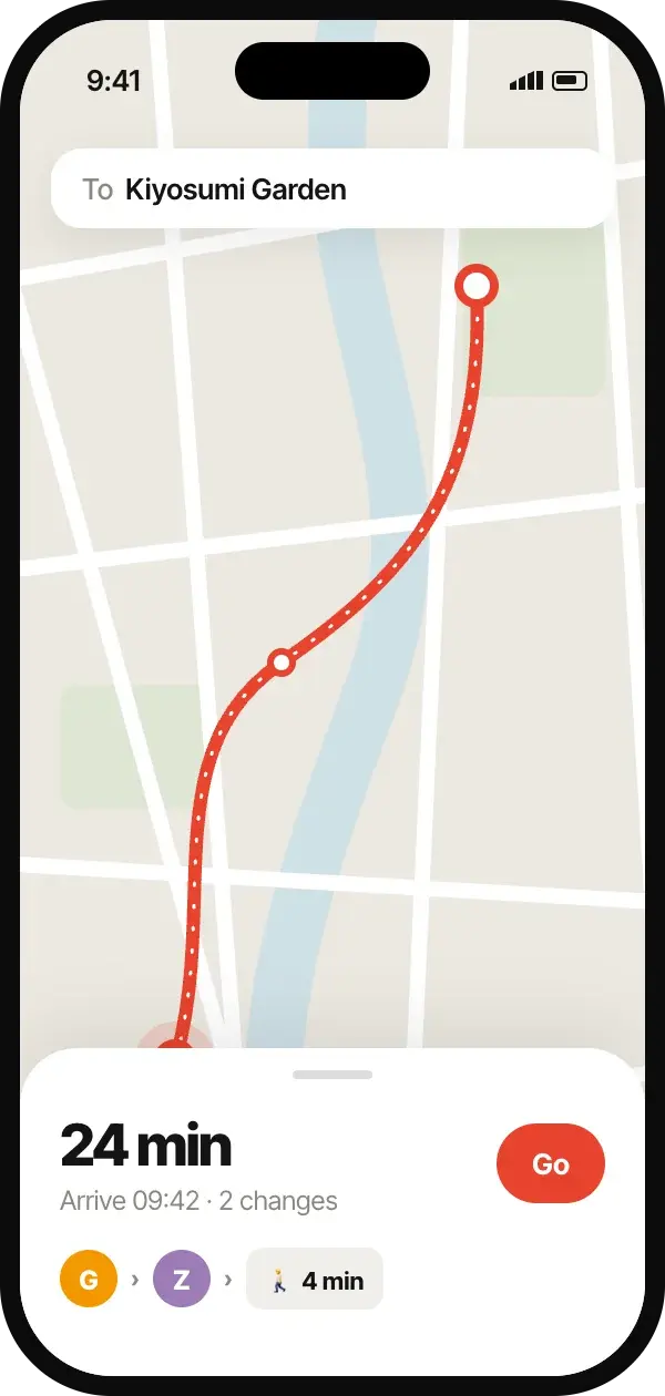
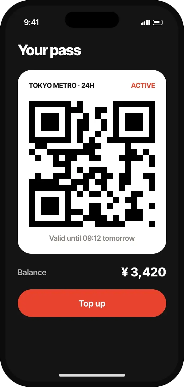
A single sheet carries the journey from planning to boarding. Swipe up for alternatives, down for the live map; the pass lives one gesture away and works offline in tunnels.
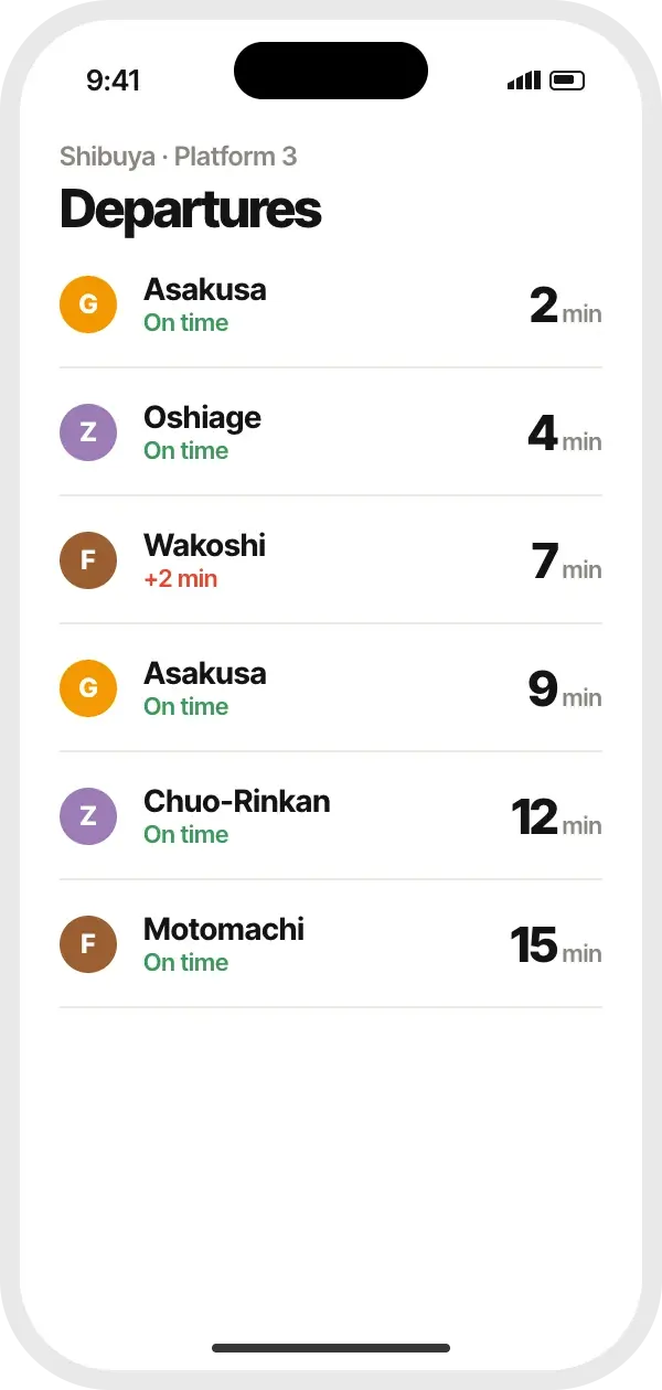
Line colours and station numbering follow the operators’ own wayfinding, so what people see on screen matches the signs above their heads.
- Client
- Metropolitan Transit Alliance · Public transport
- Audience
- Daily commuters and first-time visitors on a 13-line metro network
- Industry
- Mobility & Travel
- Platforms
- iOS, Android, Web
- Status
- Live since November 2025
- Markets
- Japan
- Languages
- 4 — Japanese, English, Korean, Simplified Chinese
02/Honors
Recognized by the editors. Awarded by the jury.
Recognition
Editors’ Choice
The editors’ highest recognition, for work that changes how its category should be designed.
Conferred by the editors on 9 Feb 2026 · minimum UXE 8.5
Distinctions
- Distinction · Interaction & Feedback
Interaction & Feedback scored 9.3 — the bar is 9.0.
Awards · Quarter 1, 2026
Season results- Interaction DesignGrand Prix
06 / 12
- Mobile ExperienceWinner
02 / 12 · Consumer
Results announced 15 Apr 2026 by the category juries.
03/Jury verdict
In the jury’s words.
“Meridia understands where it is used — on a platform, one-handed, in a crowd. It is the most context-aware product the jury has seen this year.”
Amara Nwosu
Design Director, Kestrel & Vale · United Kingdom
On behalf of 18 jurors
04/Score breakdown
How the jury scored it.
- Overall UXE Score+0.9 vs Q1 2026 average
- 9.16
- Strongest criterionUsability
- 9.4
- Jury agreementaverage spread ±0.36
- Moderate
- Jurorsof Q1 2026’s panel
- 18
- 9.4+1.1
Usability
Can people complete what they came to do — efficiently, confidently and without error?
Jury noteEvery critical task completes with one hand and at most two taps.
- 9.2+1.1
Information Architecture
Is content organized, labeled and navigable in the way people actually think?
- 9.1+0.3
UI & Consistency
Is the visual language coherent and purposeful across every screen and state?
- 9.3+0.8
Interaction & Feedback
Does every action respond clearly, promptly and meaningfully?
Jury noteHaptic countdowns and a persistent sheet make state visible without looking.
- 8.9+1.1
Performance
Does it feel fast — perceived and measured — on real devices and networks?
Jury noteSolid, though map tiles on congested networks can lag behind the sheet.
- 9.0+1.2
Accessibility
Can everyone use it, including people relying on assistive technology?
- 9.2+1.0
Learnability
How quickly does a first-time user become a confident one?
Scores are the mean of 18 jurors. Ticks mark the Q1 2026 average across 4 recognized projects.
05/The jury
18 ballotsEvery vote, on the record.
Each juror scored Meridia independently, from 1 to 10 on every criterion. Nothing is weighted by seniority and no score is discarded — the published result is simply their mean.
One juror Jury mean
| Juror | Usab | IA | UI | Inter | Perf | A11y | Learn | Overall |
|---|---|---|---|---|---|---|---|---|
| Freya HolmPrincipal Researcher, Salt Research · DK | 9.8 | 9.6 | 9.5 | 9.7 | 9.5 | 8.9 | 9.4 | 9.49 |
| Amara NwosuVerdictDesign Director, Kestrel & Vale · GB | 9.5 | 9.3 | 9.1 | 9.7 | 9.3 | 9.3 | 10.0 | 9.46 |
| Priya RamanHead of Product Design, Tessera Cloud · IN | 9.6 | 9.5 | 9.5 | 9.0 | 9.5 | 9.2 | 9.8 | 9.44 |
| Mateo ÁlvarezInteraction Designer, Lumbre · MX | 9.6 | 8.8 | 9.6 | 9.5 | 9.6 | 9.4 | 9.1 | 9.37 |
| Ravi MenonWeb Performance Engineer, Quickline · SG | 9.9 | 9.4 | 8.8 | 9.7 | 8.7 | 9.4 | 9.5 | 9.34 |
| Min-jun ChoDesign Lead, Seoul Form · KR | 10.0 | 9.2 | 9.0 | 8.9 | 9.1 | 9.3 | 9.4 | 9.27 |
| Kwabena AsanteService Design Lead, Adinkra Digital · GH | 9.5 | 8.9 | 9.2 | 9.2 | 9.0 | 9.1 | 9.6 | 9.21 |
| Sofía MarínAccessibility Lead, Clarosol · ES | 9.2 | 9.1 | 8.7 | 9.2 | 9.2 | 9.6 | 9.3 | 9.19 |
| Mei TanakaUX Research Lead, Hoshi Labs · JP | 9.4 | 9.2 | 9.2 | 8.6 | 9.0 | 9.4 | 9.3 | 9.16 |
| Tomasz WójcikMotion Design Lead, Kadr Studio · PL | 9.3 | 8.8 | 9.2 | 9.5 | 8.6 | 9.0 | 9.3 | 9.10 |
| Zara HassanHead of UX, Sahel Pay · AE | 9.3 | 9.5 | 9.0 | 9.4 | 8.6 | 8.9 | 8.9 | 9.09 |
| Jonas LindDesign Engineer, Fjordline Systems · SE | 8.9 | 9.8 | 8.8 | 8.8 | 8.7 | 8.7 | 9.7 | 9.06 |
| Hana NovákováStaff Product Designer, Brno Works · CZ | 9.0 | 9.5 | 9.0 | 9.8 | 8.7 | 8.2 | 9.1 | 9.04 |
| Marco BelliniSenior Product Designer, Studio Vetro · IT | 9.6 | 9.0 | 9.4 | 10.0 | 8.0 | 8.3 | 9.0 | 9.04 |
| Lea FischerDesign Systems Lead, Kanton Group · CH | 9.3 | 9.0 | 9.1 | 9.1 | 8.8 | 9.0 | 8.6 | 8.99 |
| Olivia GrantVP of Design, Harbor & Pine · US | 9.2 | 9.0 | 9.1 | 9.3 | 8.5 | 8.8 | 8.8 | 8.96 |
| Lukas BrennerPrincipal Product Designer, Feldwerk · DE | 9.2 | 9.1 | 8.9 | 9.3 | 8.9 | 8.8 | 8.1 | 8.90 |
| Ana CostaInclusive Design Researcher, Maré Digital · PT | 8.9 | 8.9 | 8.7 | 8.7 | 8.5 | 8.7 | 8.7 | 8.73 |
| Jury mean | 9.4 | 9.2 | 9.1 | 9.3 | 8.9 | 9.0 | 9.2 | 9.16 |
| Spread (σ) | ±0.31 | ±0.29 | ±0.26 | ±0.39 | ±0.41 | ±0.37 | ±0.46 | ±0.20 |
marks each juror’s area of expertise. Deeper tint, higher score.
01
Submitted
12 Jan
Entry received, free of charge
02
Jury scoring
26 Jan – 6 Feb
18 independent ballots
03
Recognized
9 Feb 2026
Editors’ Choice
04
Awards
15 Apr 2026
Grand Prix · Interaction Design
06/Screens
3 screensThe product, screen by screen.
07/Case study
From problem to proof.
The challenge
Riders juggled three apps — a planner, an operator app for disruptions and a separate ticket wallet — and still missed trains. Visitors struggled most at transfer stations with several operators.
The approach
Studio Kanso shadowed riders at peak hours and designed for one hand and ten seconds. The journey became a single persistent sheet; everything else was pushed one gesture away.
Research
Field observation
120 hours on platforms at 8 major transfer stations
Contextual interviews
46 commuters and 22 visitors
Tree testing
Navigation structure validated with 600 participants
Key insights
- 01
At a platform, the only question is “which door, which train, how long?”
- 02
Visitors trust colours and numbers more than station names they can’t pronounce.
- 03
Tickets must work without signal — tunnels are where people need them.
Outcomes
3 → 1
Apps needed per journey
self-reported, 3-month cohort
−47%
Missed transfers
visitor cohort vs. control
92%
First-journey success
unmoderated tests, n=300
Outcomes are reported by the submitting team and reviewed by the jury.
08/Accessibility & performance
Built for everyone, on any device.
Accessibility
WCAG 2.2 AA
Audited by In-house, verified by Hoshi Labs, October 2025
9.0
Jury
- Step-free routing with lift status as a first-class option
- Line identity uses number + letter + colour, never colour alone
- Haptic countdown for departures on locked screens
- High-contrast theme tested with low-vision riders
Known gaps
- Station maps are not yet available as text alternatives
Performance
4 of 4 within budget
Mid-range Android on congested 4G, CrUX-style p75 over 28 days
8.9
Jury
| Metric | Measured | Budget |
|---|---|---|
| Cold start | 0.9 s (within budget) | ≤ 1.0 s |
| Departures refresh | 180 ms (within budget) | ≤ 300 ms |
| Offline pass availability | 100% (within budget) | 100% |
| Install size | 44 MB (within budget) | ≤ 60 MB |
Within budget Over budget
09/Design system
Kanso UI, the system behind Meridia.
- System
- Kanso UI
- Components
- 58
- Design tokens
- 186
Color
- #141414
Ink
- #E8432E
Vermilion
- #F1EFEA
Washi
- #F39700
Line G
- #9B7CB6
Line Z
Typography
Inter Tight
Interface & wayfinding
Google Fonts
UX patterns
- Bottom sheets
- Live data
- Offline mode
- Wayfinding
- Wallet passes
10/Credits
The people who made it.
Studio
Studio Kanso
Tokyo, Japan
Named after the Japanese principle of simplicity; specialists in mobility and public-space interfaces.
- Founded
- 2014
- Team
- 11–50
- Recognized
- 1
Team
- Haruto SatoCreative Director
- Aiko MoriLead Interaction Designer
- Ren IshikawaUX Researcher
- Yui KobayashiMobile Engineering Lead
- Client
- Metropolitan Transit Alliance
- Industry
- Public transport
Built with
- Swift
- Kotlin
- GTFS-realtime
- Mapbox
- Next.js
- Figma
→/More from the showcase
Whole seasonMore from Q1 2026.
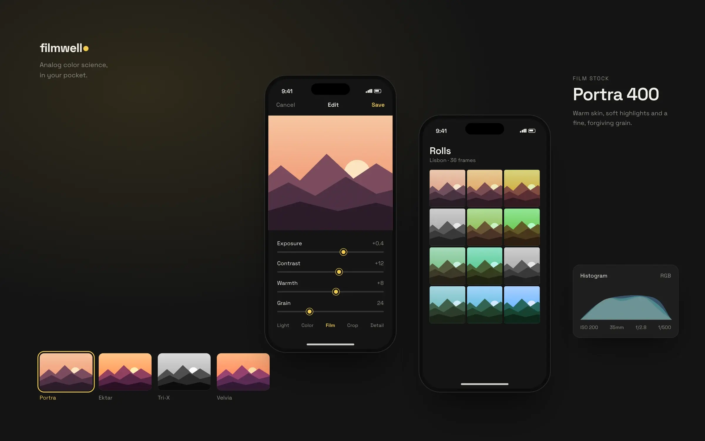
Filmwell
Kodo Studio · South Korea
7.30
UXE
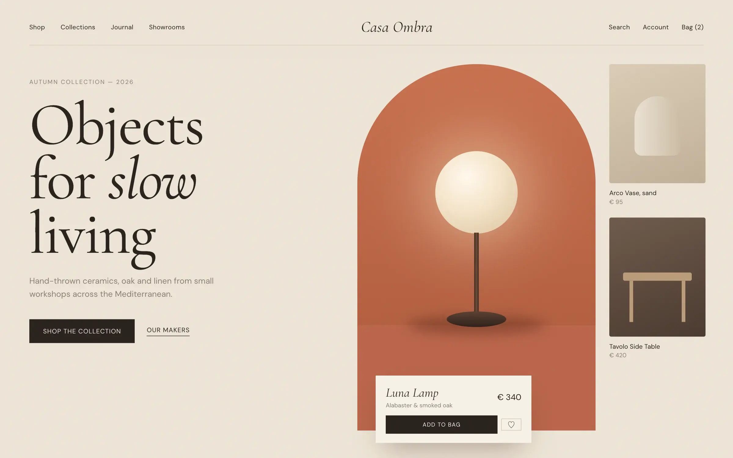
Casa Ombra
Studio Ferro · Spain
8.44
UXE
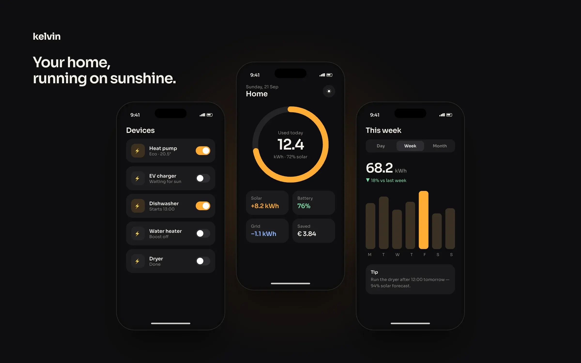
Kelvin
Vatn Design · Denmark
7.94
UXE